Five Tips for Designing your Business Banners
Business banners are great marketing tools for companies of every size. They are durable, cost-effective, and have the potential to influence the behaviors of hundreds of customers on a daily basis. Custom business signs may be used in numerous ways. Inform shoppers of specialized services, new merchandize, discount prices, or special events. When you’re ready to design business banners and signs for your organization, consider the following design tips:
- Choose a compelling color that portrays your brand’s identity. Don’t get caught up with “trendy” color combinations that have nothing to do with your logo or company image. Doing so can actually be a turnoff for potential clients. Think about the longevity of the banner and the ability to use it next week, or in a few months. Choosing a single color for the background will make a custom sign seem more polished and professional.
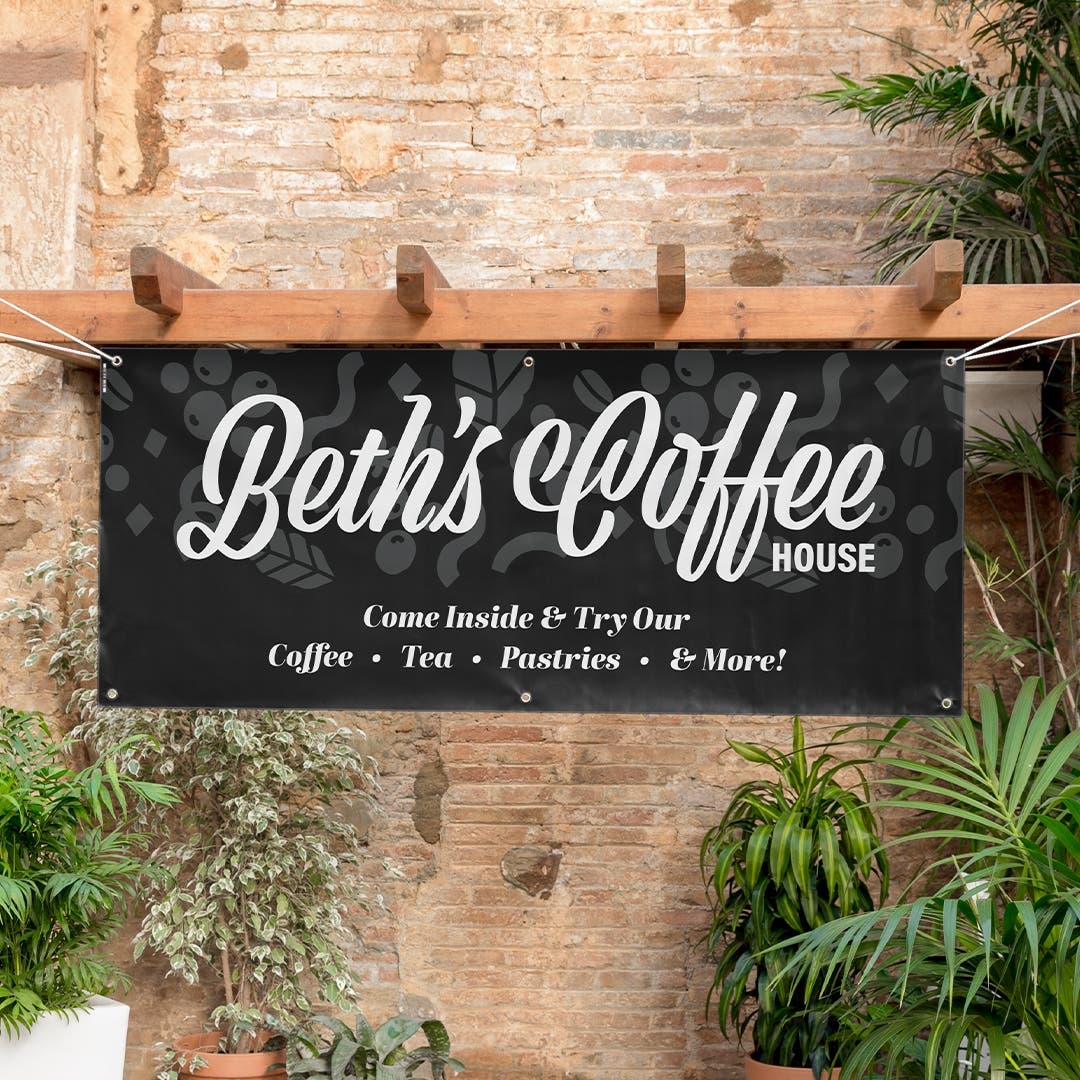
- Consider the contrast between your background color and the text/graphics you plan to print on the banner. Contrast determines the readability of business banners so pair colors with opposite features. Use dark text on a very light background, for example. Do not pair colors that are too similar because customers may be able to read the banner clearly.
- Size is an important factor for custom business banners. There are numerous size options on BuildASign.com and the size you use will depend on the location you plan to place it. If you have space and want your sign to be read from a long distance, a larger banner will be more effective. If you are restricted with space, on the other hand, use a size that works but increase the size of your text to create the appearance of a bigger, bolder message.
- Fonts tell a story of their own. They can make a business seem quirky, serious, playful, helpful, etc. Simplicity is usually the best option. Fonts that are too intricate or detailed may be difficult for people to read as they are passing by. Also, limit the style of font to two at maximum – and make sure they complement each other.
- Choose a material for your business banners and signs that will withstand the elements of nature. Sunny spots may cause signs to fade over time while constant precipitation can cause wear and tear. BuildASign.com offers many options to choose from such as vinyl banners, mesh outdoor banners, retractable banners, etc. When choosing a particular material, the colors, graphics, and text should all work seamlessly to create a custom sign that looks attractive and is easily readable.


 Order Status


